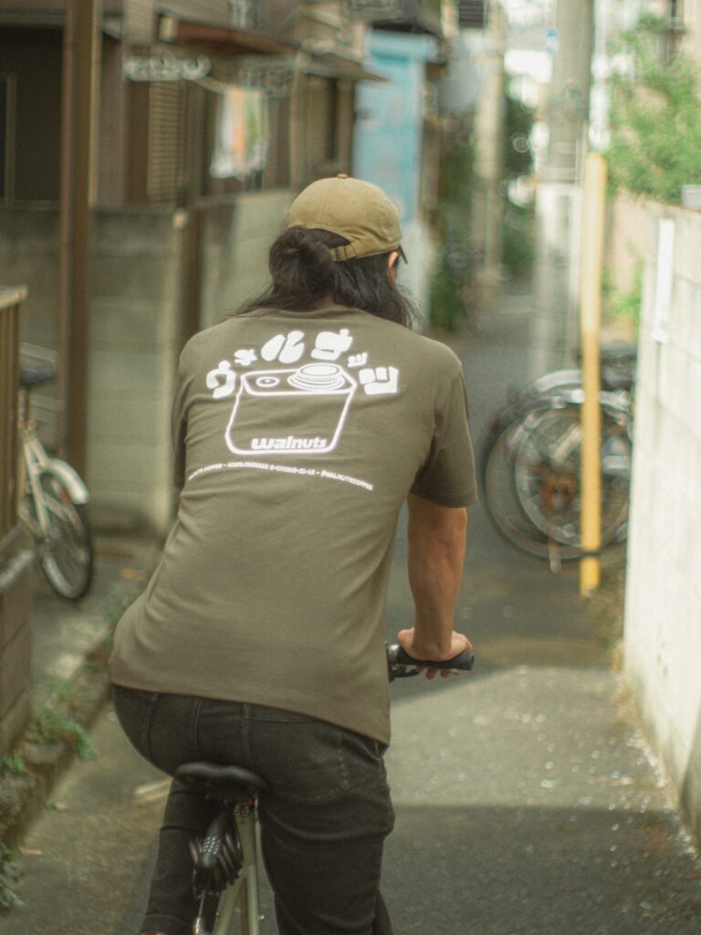
services rendered: project planning, graphic design, marketing
description: a passion project of mine and a collaboration between myself and my good friend Nathan Heidacker. Yūgen is an e-commerce platform for up-and-coming ceramic artists from across Japan to sell their works abroad. I worked briefly on a similar e-commerce platform over the COVID-19 pandemic, but the timing wasn’t right for a full launch at the time. The idea for Yūgen was inspired by my experience in Japan’s ceramic industry as well as my thesis research in Mashiko, a pottery-producing enclave in Tochigi Prefecture just north of Tokyo.
During the course of my research and after numerous discussions with young potters, I came to understand that Japan’s art industry is largely dominated by legacy establishments, such as department stores and high-end galleries, both of which can be difficult for aspiring artists to penetrate without the right connections. On the other hand, many artists also expressed some hesitance about selling their works through an online platform: many artists have come to value the experience of a face-to-face transaction where a customer can speak directly with the artist and handle their wares before purchasing. In order to create a better platform for artists, I went into Yūgen with two priorities: an artist-first platform where each piece is accompanied by detailed information on its creator, and a novel approach to displaying pieces via 3D-modeling, allowing customers abroad to emulate the experience of turning a piece over in their hands and view it within the context of their space.
In order to execute this project to the degree I felt it deserved, I worked alongside Nathan to collaborate and build the web platform in real-time. While I handled business operations on the back-end and designed the brand identity and its associated assets on the front-end, Nathan incorporated these ideas into a cohesive e-commerce platform complete with responsive 3D-model displays. While we initially looked into gaussian splatting as a method to better capture the light refraction of translucent glazes in high fidelity, we decided to go with more traditional 3D models for ease of use and scaleability.
Items on the site display detailed information using our “cards” system that fetches informational cards for each piece using its associated tags. As cards are continuously added to the backend, they will populate the listings for relevant pieces in order to give customers more clarity on aspects such as clay type, visual styles, and historical relevance of a certain style or locale. In doing so, we hope to provide potential buyers with a repository of Japanese pottery knowledge that was otherwise inaccessible or impractical to incorporate alongside an online listing.
While most of the backend work for Yūgen has been completed, there’s still much work to be done before the platform can be launched fully. We’re always looking for partners to join our platform, so if you’re interested, please shoot me an email over at kevin@yu-gen.jp!